How to Run a User Discovery Interview

I’ve written more about why and when user discovery interviews should be done as a form of UX research here. In this post I will talk about how they should be done.

The way I run interviews feels more like a free flowing conversation, digging into nuggets as they arise, but I always have a base set of questions and a very strict set of goals for each interview. I view it as being a therapist. I don’t know how the conversation will branch out, that’s why it’s discovery. But I have a core set of goals regarding the conversation, I typically want to uncover problems they face about a very specific activity. I also have a core set of questions and guidelines. 

The predetermined questions just serve as a tool to get the conversation going, and open them up to opening up. The thing that makes the difference between an okay interview and an amazing interview are the follow up questions. Their answer will lead to me digging further with improvised questions that aim to dig deeper, typically “How” and “Why” questions, asked at the right time, going on conversation tangents. It shouldn’t actually feel like an interview.

The starting point questions are centered around the following:

  • Can you walk me through a typical process for [activity in question]? [The goal of this is to understand the status quo.]

  • What’s most frustrating about this process?

  • What do you enjoy about this process?

  • What does success look like [within this activity]?

  • What are your biggest hurdles to achieving that success you just defined?

  • Demographic info to see if there are any patterns in their responses based on their position, tech savviness, or other relevant factors

They should open the door to many follow up questions and let the conversation flow. I don’t mean it lightly when I say it’s like being a therapist.

2 Critical Things About Your Users For a Great User Experience

In the world of user experience, the user is always right. If they don’t understand something it’s because you screwed up. If they intend to achieve a certain goal, but end up clicking something that doesn’t contribute to that goal, you screwed up. If they think a concept on your application means one thing, but it actually means another, that’s also on you.

It’s always better to make your product overly-user-friendly, rather than not user friendly enough. Some designers are big on creating personas. A persona being oftentimes a made up character with a stock photo of someone smiling, their fake hobbies, favorite fake books and how they sustain themselves financially in their made up world. The point of this are to create empathy with your end users, supposedly your end users being these fictional characters. I never liked User Personas, maybe because I typically had the privilege of meeting real users through interviews or user tests, or creating that empathy by talking to industry experts. But that’s not always a luxury that’s available. My real issue with user personas is that there are a couple of things that are absolutely critical to creating user friendly design about your users, and they’re typically not included in traditional user personas.

The first extremely important way to think about your end user is: exactly how tech savvy are these end users? Are they software engineers? Do they use video editing applications on their MacBook? Do they use third party photo editing on their phone? Do they only surf Instagram and not actually understand the difference between a Story and a Post (looking at you Mom)?

Finding this out as a fact can be difficult, especially in an early stage when there are no users to talk to, you’re essentially guessing. But someone whose a software engineer, can definitely use a tool that’s designed for your Mom, whereas your Mom can’t use a tool that’s designed for someone who even uses third party photo editing on their phone. Always be conservative on this estimate and keep it in mind when designing. 

The second most important way to think about your end user is: what are their perceptions and knowledge of certain concepts you’re using in your product? This becomes especially important in B2B applications, especially when it’s for a specialized industry. When designing for such an industry, speak their language, but be sure that you’re speaking the correct dialect. That’s why it’s especially important to work with an industry expert who has a very clear sense of what concepts people lower down in the industry chain, who are typically the end users of such a software product, perceive and grasp. In such an industry a certain word or phrase can be perceived differently when compared to a different industry or segment within it. In cases where they do know a lot of specialized knowledge, you can take advantage of that. Just because you don’t understand what a “Split Phase Breaker” is, doesn’t mean your electrician users will need educating on it. But these electricians might not be using Instagram correctly. Who cares what books they read or what their favorite color is. Focus on what matters in those personas.

Good UX is great communication with the users, and to do that you need to speak the same dialect, both in terms of language used and in terms of user interactions.

Bare Minimum UX Research

I’ve noticed with my clients that the first thing cut is UX Research, usually because of some timeline or other resource constraint. I understand that not everyone has a UX Designer on staff or the time to do UX Research. But the absolute lack of it results in much more wasted time further down the line. Not doing the basic amount of UX Research in order to save time now, is multiplying that “wasted time” and delaying it to be dealt with at a later point. It’s procrastinating time wasting.

At the very, very minimum, for new features and new products, User Discovery Interviews should be done. The reason that I’m leaving out usability testing from this baseline minimum is that I think usability can always be improved through iterations and testing, but what can’t be improved is having built something that tackles a problem that doesn’t exist or isn’t pressing enough to the target market. This is especially important for Enterprise and B2B products. 

User Interviews should be done even if you’re your own target market, because the way you currently do something, or the importance you put on a problem you face, is either unique or distorted. Distorted because you need a lot of self awareness to judge your own process without biases and blindspots. This is especially true when building a new feature or product, which can be exciting, which adds emotionality to the decision making.

The goal of the basic user interview should be to find out “Is this a problem (underlying issue) they actually care about?” This, obviously, shouldn’t be asked directly due to the general lack of self awareness we have as humans. It should be found out indirectly by learning about things such as the following:

  • What is the current process used to use to solve the problem in question, step by step, in detail, ideally demonstrated with specific real life examples.

    • What do they like about it?

    • What’s most frustrating about it?

    • What is this process costing them?

You can do this with multiple hypotheses of the problems faced, utilizing one customer discovery interview to learn about multiple opportunities. Learning about the status quo of how their various problems in the specific space you’re working in are solved, is the ultimate goal. That will validate the problem you’re working on, or help you discover deeper, more important underlying problems to tackle. Even five interviews will save you a bunch of time later down the line.

Responsive Analytics Dashboard UX/UI Design Case Study

"Really great UX/UI consultant. He did outstanding work for us. We will definitely use Arvand again and can recommend him highly." -Kristian, Technical Lead of Build

Defining the Minimum Viable Product

The client approached me wanting a brand new B2B analytics application designed. I asked the client extensive questions to discover that the business goal of the designs is to communicate and sell their product idea to onboard potential users, as well as investors through presentations. The client had written out several documents with product specs that specified the product features that they wanted. I asked the client hard hitting questions to discover the true underlying purpose of the application, what problems it's meant to solve, the user acquisition strategy, the user retention strategy and so forth, in order to truly be able to break down the list into must-have's, and nice-to-have's. Breaking down the list as such, allowed me to define the Minimum Viable Product, while keeping in mind that some additional features need to be designed for presentation purposes... since the ultimate goal is to sell the idea to investors and potential users. I worked with the product specs document they had written, but questioned, and criticized the features that did not make sense to me from a usability and product strategy perspective. Through this process, the client and I reached a final list of features that we agreed should be in included in the designs, which revealed 3 user types.

deletehitsthistsh.jpg

Designing Mobile First

Each user type had a separate goal, and use case. I determined what device each user would be using, and designed each user type's UI appropriately on that device, while considering any technical limitations. I first designed for the user type where most of the UI elements would be carried over to the other 2 user types. I designed this mobile first since once the time comes to convert the design to other screen sizes, it's relatively simple to add elements (on bigger devices), but it's extremely difficult to subtract them.

deletethistoo.png

Brainstorming UX/UI Designs for Displaying Data and Analytics

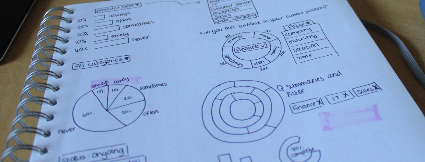
When designing mobile first, I always sketch pen to paper first, since this way I can go through many variations in a short period of time before committing designs to a computer program and in this case it was no different. I tackled what I perceived to be the most complicated UI problem to solve in this app... how to present analytics data. To do this, I had to create a deep empathy with the user by really immersing myself in their headspace by learning about what problems this data would be solving, what specific question they would be trying to answer with this data, and what tools they are using now to address these problems. Some of this was achieved through research, some by talking to the client, and some by speaking with individuals who fit the user persona.
One key tactic I used in order to break down this complicated data into analytics graphs that were intuitive to the user, was to break down the data into how it would be read in simple English, for example: "Department X overwhelmingly responded 'always', Department Y mostly responded 'never'." Some of these got more complicated, since some use cases required datasets to be compared to each other. For these, I used the same tactic, by breaking down the problem that the user is aiming to solve, the question the user is aiming to answer, and how the user would read the data in simple English. 

deletethis.png


Designing the App's User Flow Wireframes

Once I was happy with the various methods of laying out the analytics, I proceeded to designing the mobile application's information architecture and overall user flow. I quickly did this on paper since by this point I had a really good idea of how it would look. 

At this stage I had all the core UI that I needed to move onto the computer. My tool of choice is Bohemian Sketch. I converted the analytics UI, as well as the basic user flow into the wireframes for the mobile device. This went through several iterations with the client, as expected. Some things that came up out of discussing the wireframes were new use cases, as well as edge cases that should be addressed. These edge cases and some of the new use cases were integrated into the wireframes. I also designed the additional features that the 2nd user types would see and experience on mobile.

Artboard 7.png


Converting Mobile UI to Desktop UI

Once we were happy with the mobile designs, I moved onto the desktop use cases, and desktop user types. This was essentially converting the mobile designs into desktop, and including additional information, with a couple of additional use cases. This was an iterative process of playing around with grids and layouts until it made sense for desktop, and made sense for the user's goals. Special attention had to be paid to the hierarchy of information, since the user has a specific goal in mind in this use case and a lot of data to look at on a big screen. I went through several iterations of this with the client before we had covered all edge cases and we were both happy with the designs. I went through the same process with the 3rd user type for desktop.

Artboard 9.png


Prototyping the Mobile Analytics Interaction Design

I created a mobile prototype using InVision to make sure that the interaction design of the most complicated UI elements were intuitive. This prototyping exercise led to discovering a few potential interaction sticking points that might not be obvious to the user. These issues were addressed, and re-prototyped. You can see the final mobile InVision prototype here.

https://invis.io/ZK96J2A85

Analytics Visual Designs

The last step was making it all look beautiful. I asked the client about the emotions and perceptions they aimed to evoke in users, as well as some applications they find inspiring, unfortunately they had none, which pushed me to play around with a variety of different hues, saturations, and color combinations. This iterative process resulted in the final designs seen below.

deletethisman.jpg