get the most out of a usability test

I will outline the best way to get the most out of usability tests. This is what we have found to be most effective when we run our user tests for clients.


Data Analysis

Using MixPanel, or any events based analytics tool, we analyze your data to identify usability sticking points (i.e. "what" is wrong). If you don't have any existing data, we run a UX audit. We can then run user tests on to determine “why” it’s wrong.

UX Research Methods

We design the usability study around the hypotheses that were formed from UX audits, data analysis and just gut feel. The goal is to validate those hypotheses and uncover the "why" behind them. We also identify key performance indicators (usually based on business goals), and test the usability of the features that drive them.

UX Net Promoter Score

A key part of our user testing process is to incorporate net promoter scores, which is a fancy word for the question "On a scale of 0 to 10, how likely are you to recommend us to a friend or colleague?".

We do this to identify a baseline qualitative user satisfaction. We also do this in follow up tests to identify usability improvements that are otherwise qualitative in nature. Sometimes this also reveals polarizing results that are correlated to demographic, psychographic and perceptions of the user.

Actionable Usability Improvements

We take our findings from the user tests and prioritize the highest impact solutions that will address the findings. We then design new user flows in actionable wireframes, mockups and specs, so that your developers can implement them without any guesswork.

Snapchat's Abysmal Usability and What Led to It

Background

I'm a Senior UX Designer and I've been passively using Snapchat and following it's evolution since before it went main stream (not even trying to sound cool). I heard about it from my cousin over the 2012 or 2013 holidays who told me about this new app that was popular in her high school. At the time, there was no chatting feature, no Discover section, no "Story"... it was purely sending ephemeral video or photos to contacts you've added... then you would message them on iMessage to see if they laughed at your Snap (at least that's how I used it).

This is a screenshot I took back in February 2014, after they released the Story feature. See my original tweet here.

snapchat.jpg


A few days ago, Snapchat CEO Evan Spiegel was quoted as saying "One thing that we have heard over the years is that Snapchat is difficult to understand or hard to use, and our team has been working on responding to this feedback."  So, what led here, and why hasn't it been a real issue until now?


Bad UX Worked in Snapchat's Favor (Until Now)

Today, Snapchat has horrendous usability, but I'm willing to admit as a UX Designer that it's potentially worked in their favor up until now, as a "coolness"/exclusivity factor. If you couldn't figure out how to use Snapchat, you were too old, you just didn't "get it". It was your fault, not the apps. But now, the horrendous usability is catching up with them, as new features have been added with little foresight, resulting in a Where's Waldo type of feature discovery mixed with secretly Googling how to use various features while feeling shame.

Screenshot 2017-11-07 15.34.38.png

Google search data shows that average monthly search queries around instructions on how to use snapchat are 10x those of Instagram, and 100x those of Youtube-- a platform I consider to have great usability, partly measured by the fact that I could teach it to my 87 year old grandma who has never used a computer or tablet.

Why Did This Happen?

The big mistake that led here is something that I've noticed Instagram be extremely careful of.  For example when Instagram was just a feed, with the ability to add photos and added the ability to send direct messages, they did not hide the direct messaging ability behind a swipe gesture like Snapchat did. Instagram is not an example of perfect execution, but when you take into consideration the number of features they've added over recent years, and their ability to keep the navigational structure, and discoverability simple, they deserve credit. When these concerns are considered in design, it creates the design culture at the company, and Snapchat's design culture started out as sticking features on top of each other, and snow-balled.

Snapchat never had, what I will term a "scalable information architecture", or "scalable navigational structure". What I mean by this is a navigation structure that can be added onto, while keeping discoverability of features, and not disrupting the existing feature flow. The litmus test for this is:

  1. If New-Feature-X is added, would it in any way interrupt or confuse existing users and their use of existing features or current user flow?
  2. Is the New-Feature-X discoverable?

The way Snapchat added features over the years only met the first criteria, and only for it's core feature... for example the first criteria was not met for the Second-Feature, once the Third-Feature was added, and this snow-balled. This is very similar to regression testing software for bugs, think of it as regression-user-testing.

As for the second criteria, one big reason for the lack of discoverability is that a lot of the features are gesture based, and therefore hidden behind other features. I feel like if user tests were done, all of this could have been prevented to some degree, and would have in the long term led to a higher user adoption amongst the masses.


600% Increase in KPI from User Test Findings (Case Study)

4.5 star rating, >7 million downloads

Outcome: Increased KPI's by 600%

Note: These designs are from 2013, but the principals guiding the user test, user test results and actions taken are extremely relevant still today

fetch1.jpeg


UX Key Performance Indicators

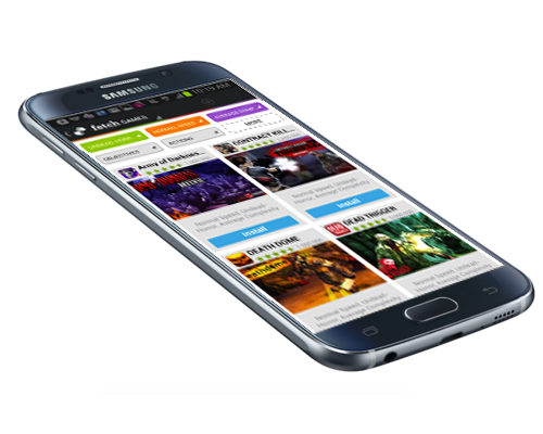
Using a combination of data analysis, prototyping and weekly user testing, I increased Key Performance Indicators by 600%, and improved the Best App Market's overall usability.

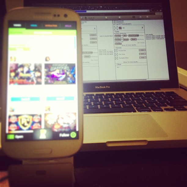
Through data analysis it was hypothesized that the more searches (ie Action-Adventure) a user follows, the more likely it is that they will be a returning user. As a result, the challenge was to increase the number of "follows" to test this hypothesis in production.

fetch2.jpeg

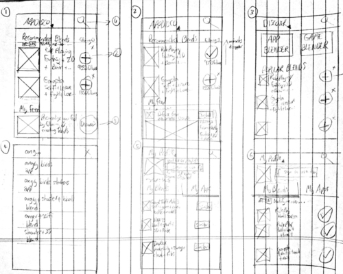
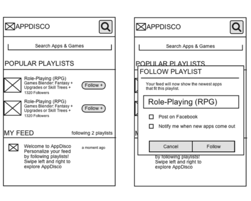
I started brainstorming ideas to increase user exposure to the "follow" button. One of the options I came up with was to place "popular playlists" (playlists were later renamed to "searches") at the top of the user’s feed, as well as in the search dialog, with a follow button that is toggled on and off next to each playlist.

fetch3.jpeg
fetch4.jpeg


Usability Test Findings

I wanted to learn how users interact with the existing "follow" functionality of the app, so I tweaked myuser tests by adding the following task: "You want to stay updated with the latest 3D Action Adventure games, what do you do?" I observed the user's action and noticed a big difference depending on whether a user had already interacted with the follow button in some way or not.

This resulted in key insights: Users would first tap the follow button when exploring the app. They would stumble upon it out of curiosity of not knowing what to expect from that button; some users even expected it to act as a search tool due to the vagueness of the icon. The large majority of users, upon clicking it, would instantly exit out of the resulting popup. The very small amount of users who did not close the popup, would then enter what they wanted to follow into the field prompting them to name their follow, not realizing that it does not conduct a new search.... because users don't read!

Another thing observed was that a very tiny percentage of the users who did use the functionality as hoped, did not understand where to go to view these apps/games that they had just followed.

Actions Taken
Using the usability test findings, I started brainstorming user interfaces and created the following mocks: they did not require a user to read, did not take the user out of their existing flow, and did not require the user to type or enter any information. One additional aspect of this was a subtle animation for users who had not previously followed anything, with the point being to draw new users to it. We launched this and saw a 600% increase in follows.

fetch5.jpeg
fetch6.jpeg

Adding a Feature or Launching an App with the Scientific Process

In this post I’ll discuss an overview of how to best utilize data, analytics, and experiments such as A/B testing, when launching a new feature. This is what I often see neglected when designers and stakeholders are caught up in wireframes, animations, and coming up with the next big feature. 


Using the Scientific Method

Lean startup, MVP, Design Thinking, UX Process-- at their core are arguably all rebranded ways of saying the scientific method, which often becomes the last step of the design process or gets completely neglected. The scientific method is a continuous process that involves the definition, and testing of a hypothesis through an experiment, resulting in measurable evidence. The measurable evidence is then compared to the predicted outcome, often times resulting in a new hypothesis, and experiment to test. So, how does this apply to designing a new feature?


Defining your Hypothesis

A feature should always be broken down into it’s smallest core part, as to make measurability more accountable. On one project I was tasked with designing the UX for adding a new comments section with the ability to Up-Vote comments, Reply to comments, and tag users in the comments section. The core hypothesis here, is that “Users will write comments”. If users don’t leave comments in the first place, there will be no comments to read, reply to, tag users in, or up-vote, so it is critical to optimize the commenting experience before adding on the rest of the features.

It’s often the case that breaking down a feature to this bare-bones level receives a lot of push-back from stakeholders such as the client, so it is important to weigh the trade-offs, as each feature and each situation is unique. For example, will adding the ‘up-vote’ feature hinder your ability to optimize the core hypothesis of leaving comments? Probably not, if that feature is designed as a secondary call-to-action, and doesn’t conflict with the core hypotheses visual hierarchy. Will adding the ability to reply to comments hinder this optimization? Same answer, but now we also need to consider that it will slow down the development and design time, time that could have been spent gathering user analytics data through an earlier launch of a smaller feature, data that could have been used for optimizing. This means that your engineering and design resources, and access to market are a factor too.


Measuring Evidence

Once the core hypothesis of the feature is defined, it should always be paired with at least one quantifiable way to measure it’s success, through an analytics tool that does event tracking-- my preferred tool is MixPanel. These Key Performance Metrics should be defined before wireframes are made, this will keep the designs oriented around the correct business goals, and make sure that the wireframes aren’t done for the sake of making wireframes. Here are examples of what should be measured:

-what % of users tap the comment button

-what % of users start entering a comment

-what % of users post a comment

-what % of users get into the ‘see all comments’ page

These data points, as with most user analytics data points, should be analyzed separately for different segments such as new users, and returning users, as they could have drastically different experiences. These results will reveal some gaping holes and opportunities in the feature’s design and optimization, which should ideally reach a comfortable level in a private beta setting before launching the feature on a mass level.

My favorite thing about this process is that you and your coworkers can be on the opposite sides of the hypothesis, and the data will determine a real winner. I have been in situations where the stakeholders did not respect the process and data, and tried to interpret it each in their own way, but that’s a bigger cultural issue.

In future posts I will cover how A/B tests and usability tests can be utilized as a part of this process.