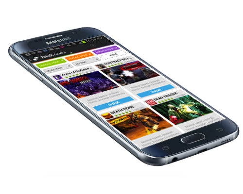
4.5 star rating, >7 million downloads
Outcome: Increased KPI's by 600%
Note: These designs are from 2013, but the principals guiding the user test, user test results and actions taken are extremely relevant still today
UX Key Performance Indicators
Using a combination of data analysis, prototyping and weekly user testing, I increased Key Performance Indicators by 600%, and improved the Best App Market's overall usability.
Through data analysis it was hypothesized that the more searches (ie Action-Adventure) a user follows, the more likely it is that they will be a returning user. As a result, the challenge was to increase the number of "follows" to test this hypothesis in production.
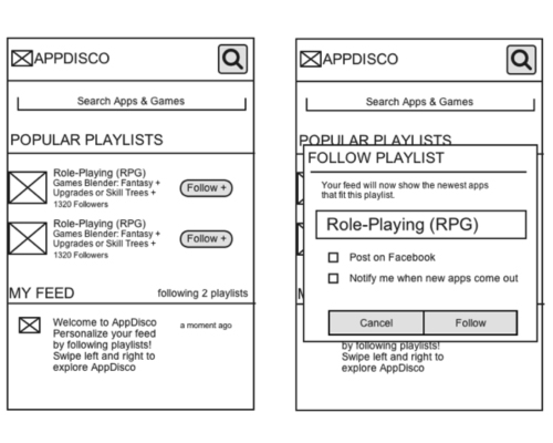
I started brainstorming ideas to increase user exposure to the "follow" button. One of the options I came up with was to place "popular playlists" (playlists were later renamed to "searches") at the top of the user’s feed, as well as in the search dialog, with a follow button that is toggled on and off next to each playlist.
Usability Test Findings
I wanted to learn how users interact with the existing "follow" functionality of the app, so I tweaked myuser tests by adding the following task: "You want to stay updated with the latest 3D Action Adventure games, what do you do?" I observed the user's action and noticed a big difference depending on whether a user had already interacted with the follow button in some way or not.
This resulted in key insights: Users would first tap the follow button when exploring the app. They would stumble upon it out of curiosity of not knowing what to expect from that button; some users even expected it to act as a search tool due to the vagueness of the icon. The large majority of users, upon clicking it, would instantly exit out of the resulting popup. The very small amount of users who did not close the popup, would then enter what they wanted to follow into the field prompting them to name their follow, not realizing that it does not conduct a new search.... because users don't read!
Another thing observed was that a very tiny percentage of the users who did use the functionality as hoped, did not understand where to go to view these apps/games that they had just followed.
Actions Taken
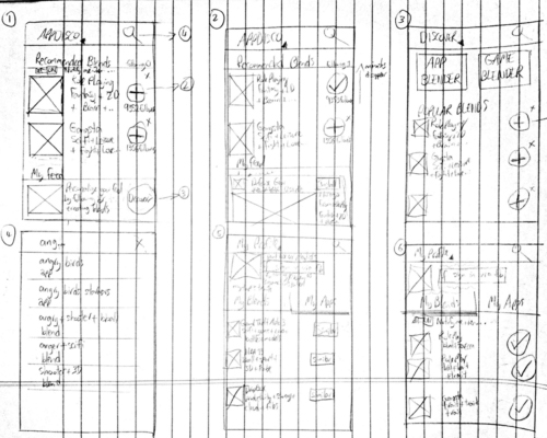
Using the usability test findings, I started brainstorming user interfaces and created the following mocks: they did not require a user to read, did not take the user out of their existing flow, and did not require the user to type or enter any information. One additional aspect of this was a subtle animation for users who had not previously followed anything, with the point being to draw new users to it. We launched this and saw a 600% increase in follows.


